
#206 Blog Post Wednesday, 5 February 2025
Posted by Denny Hatch
http://dennyhatch.blogspot.com/2025/02/206-book-covers.html
You Can Judge a Book Designer by the Cover.
On average The New York Times reviews 1300 books a year.
Below: the Times' Critic's Choice for Best Book Cover of 2024.

Title: Alphabetical Diaries
Author: Sheila Heti
Publisher: Farrar, Straus & Giroux
Cover Design: Na Kim
Cover Design: Success or Failure? Catastrophe!!!
Published: 2024
Hard Cover: $27.00
By: Matt Dorfman, designer, illustrator and an art director of The New York Times Book Review since 2015.
"This
cover is both an instruction manual for how to read a book and an
audacious language experiment. Interlocking the author's name with her
title in the style of a word search, the design demonstrates how the
cover's behavior rhymes with the author's alphabetical project by
singling out an "A," "B" and "C" with pops of a different color. And the
type choice clearly signals that this is an experiment we're meant to
have fun with. It's easy for such distinct tasks to conflict on the face
of a book. It's Hard to harmonize them this playfully. —Matt Dorfman
Matt Dorfman saying "This cover is both an instruction manual for how to read a book and an audacious language experiment..." is preposterous!
The
cover is the publisher's formal announcement to the world that this new
book really exists. The cover
is the most important advertisement for the book itself. It will be seen in bookstores and libraries. It will appear in all
ads, promotional brochures, press releases, book reviews, newspaper
feature stories, author's bios and catalogs in print and online. In
short, the cover is how people recognize this new book for all time. Not a treatise on how to read it!
Four Hard and Fast Rules for Successful Book Cover Design.
Rule #1: Title and author's name must stand out and be immediately easy to read.
Rule #2: Title is the most important element on the cover. It identifies the book, making it unique, special and standing apart from the other 189 million books in print.
Rule #3: Occasionally the author's name may be larger than the title. If
the writer is a show-biz celebrity, politician, best-selling author — a
name that is instantly recognized and would be a huge sales hook...
yeah, give this star top billing on the cover and title page.
Rule #4: No Limits. The cover is the main salesman for the life of the book. It can feature exciting colors, jarring type fonts and gripping illustrations to give a flavor of the goodies that await readers. Anything goes, so long as the title and author are obvious and easy to read.

Okay, why is this Times' winning cover design a colossal flop? Shoppers are busy people. In this book cover the title and author are totally hidden somewhere in a smarty-pants designer's word salad. What's the name of the book? Who wrote this thing? Designer Na Kim is trying to force me to drop everything and spend precious time solving the puzzle of the title. I ain't got the time. In short... this #1 New York Times' Best Book Cover 2024 is strange as hell and an instant deal killer.
Another Terrible Runner-up Cover from the Dozen
Chosen by the Times as Best Book Covers of 2024.
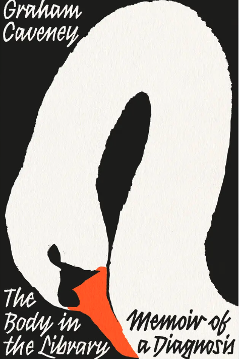
Title: Body in the Library/Memoir of a Diagnosis
Author: Graham Caveny
Publisher: Bahamut Media Ltd. (UK)
Cover Design: David Pearson
Published: 2024
Paperback: $18.25
By: Matt Dorfmann, "If it weren't for the oblique clue in the subtitle, you would have no idea that cancer is the driving agent of this memoir. In all other respects, the design smartly widens its aperture, using one of mankind's cohabitants in the natural world — a swan — to hit an existential note about anticipating the end of a life and how one might (literally in the swan's case) bow out with grace. —Matt Dorfman
A Truly Bizarre, Difficult-to-read Cover Design.
At the very top left-hand corner is author's name in strange, very small and difficult-to-read cartoonish script font.

Meanwhile across the very bottom of the cover is the title/subtitle in the this same teennsy difficult-to-read cartoonish script .

Compare These Weird-o 2024 Designs with the
Most Successful Book Cover in Modern History!

Title: GONE WITH THE WIND
Published: 1936
Author: Margaret Mitchell
Publisher: Macmillan
Jacket Design: Alas, couldn't find anywhere.
Hardcover: $3.00
Design Wizardry.

"Your
First 100 Words Are More Important Than the Next Ten Thousand."
—Elmer
"Sizzle" Wheeler (1903-1968)
Elmer
Wheeler, author of nine books on public speaking and how to sell, was famous for saying, “Don’t sell
the steak, sell the 'sizzle'.” Here
are the first hundred and eighteen words of Gone With The Wind, the greatest best seller since The Bible. No kidding.
SCARLETT O’HARA WAS NOT BEAUTIFUL, but men seldom realized it when caught by her charm as the Tarleton twins were. In her face were too sharply blended the delicate features of her mother, a Coast aristocrat of French descent, and the heavy ones of her florid Irish father. But it was an arresting face, pointed of chin, square of jaw. Her eyes were pale green without a touch of hazel, starred with bristly black lashes and slightly tilted at the ends. Above them, her thick black brows slanted upward, cutting a startling oblique line in her magnolia-white skin—that skin so prized by Southern women and so carefully guarded with bonnets, veils and mittens against hot Georgia suns.
In This Otherwise Gargantuan Saga


From Seattle legendary direct marketing guru Bob Hacker: "So, so true. Designers can prevent sales better than better than anybody in pursuit of their creative jollies."
ReplyDeleteBob, always great to hear from you. Love it when you agree with me. Love it also when you disagree with me, because that's when I learn stuff. Do keep in touch. —DH
ReplyDeleteHello, Denny. I have survived the Los Angeles fires, although like everyone else I developed a sore throat and cough for a few days. That’s the result of breathing air similar to the bottom of an ashtray. The City of Los Angeles (or County?) sent out an urgent text to evacuate at once. Some of my neighbors did so. Later in the day, it sent another text----- “Ignore the earlier message.” (Their database and software were not quite up to snuff; there were repeated false evacuation messages.)
When I see book covers like these, and the gibberish from the critic, I have two thoughts:
1. What would Claude Hopkins, Caples, Sackheim, David Ogilvy, or any other top adman think of such nonsense? For that matter, where are Mark Twain, H.L. Mencken and other humorists when we need them?
2. I am reminded of a professor at San Jose State Univ. many years ago, in the Industrial Design Dept. or Marketing Dept., I forget which, who told his class that the text of an ad didn’t matter. Rather, one only used blocks of copy as a graphic element, e.g. to balance a photo, and no one ever read or cared about the words. This made an impression on my late brother, who worked with me in various mail order businesses, and, like me, had devoured Claude and the other classics.
Actually, I have other thoughts about graphics like this and accolades given to them, but those thoughts are unfit for print.
Regards,
David Amkraut
David, Many thanks for the splendid judgment call. Yeah, this was like shooting fish in a barrel or something. Good fun. —DH
What a wonderful man you are! My best to the wonderful Peggy.
ReplyDeleteDrayton [Bird]
Want to do better?
Go to AskDrayton
Drayton,
Great hearing from you. Thank you for your kind words. Lotsa fun!
—DH
Denny,
ReplyDeleteThis is one of your most interesting blogs for me. Well done.
Jonathan
To: J.C.
Yeah, this was fun, Jonathan. I do feel sorry for people who make horses' asses of themselves. Do keep in touch! —DH