Posted by Denny Hatch
New Faces in Direct Mail
Are Trashing the Old Rules
Share Local Media aims to reimagine the world of offline marketing for tech and e-commerce companies.
As a full-service agency,
program operator, and SaaS technology platform Share Local Media Helps tech and
e-commerce companies leverage direct mail to achieve efficient direct response
outcomes with high quality branding.
https://www.builtinnyc.com/company/share-local-media
= = = = = = = = = = = = = = = =
“People don’t buy from clowns.” —David Ogilvy
= = = = = = = = = = = = = = = =
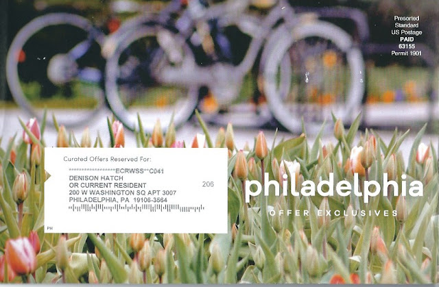
It All began with This 6” x 9” Envelope
And Its Ten 5-1/2" x 8-1/2" Inserts.
• "The wickedest of all sins is to run an
advertisement without a headline."
—David Ogilvy
• “Avoid text printed over, or reversed out
of, a busy or distracting background.”
—Ed Elliott
Who Sent This? I Went Online And Found
These Clowns’ Manifesto Is Gibberish.
ABOUT
"Share
Local Media (SLM) aims to reimagine the world of offline marketing for tech and
e-commerce companies. We started as e-commerce marketers ourselves, and
launched SLM with a goal of turning direct mail into a high performing,
scalable channel for a digitally native client set. To do so, we’ve taken an
inputs based-approach to the space, and re-engineered the channel from the
ground up to make it easier to test, faster to execute, more measurable, and
ultimately, more effective for e-commerce and tech clients of all types.
"We live and breathe direct response marketing, and strive to delight clients with high performing campaigns built around fast, data-driven client service, and premium, unique branding."
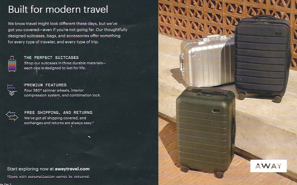
Now Let's Have a Look at an Insert
Written and Designed by the Clowns
• “Avoid text printed over, or reversed out
of, a busy or distracting background.”
—Ed Elliott
Built for modern travel
We know travel might look different these days, but we’ve
got you covered—even if you’re not going far. Our thoughtfully
designed suitcases, bags and accessories offer something
for every type of traveler, and every type of trip.
THE PERFECT SUITCASES
Shop our suitcases in three durable materials—
each one is designed to last for life.
PREMIUM FEATURES
Four 360º spinner wheels, interior
compression system, and combination lock.
FREE SHIPPING, AND RETURNS
We’ve got all shipping covered, and
exchanges and returns are always easy.*
One day a man walked into a London agency and asked to see the boss. He had bought a county house and was about to open it as a hotel. Could the agency help him to get customers? He had $500—to spend. Not surprisingly, the head of the agency turned him over to the office boy, who happened to be the author of this book. I invested his money in penny postcards and mailed them to well-heeled people living in the neighborhood. Six weeks later the hotel opened to a full house. I had tasted blood!
—David Ogilvy, Ogilvy on Advertising
• Direct mail is the world’s oldest advertising technique; it goes back to 10 July 1194 A.D.
• Direct mail is a not a slow, clunky, cumbersome, hugely expensive antique step-child of advertising. “Direct mail is the aristocrat of advertising.” —Lew Smith
• Never forget the direct marketing business
hub started off as the DMA (Direct Mail Association) and over the next half-century
went through myriad industry name-changes. Three years after it started calling
itself “Data Driven Marketing” the entire once- massive and influential organization
was basically outta business—a faint shadow of its grand former self.
• In this epoch of the Internet, Social Media, TV, robo-calling and print advertising, direct mail is the only safe medium to use when you are testing a new product or service and be guaranteed it won’t be picked up, stolen and sold around the world by Chinese thieves and counterfeiters even before you’ve finalized your start-up financing.
• A simple, plain-Jane direct mail 775-word non-personalized junk mail letter was the most successful advertisement in the history of the world.
• Direct mail is the only medium where you can test small, precisely analyze response results, run confirming tests and—if the numbers hold up—roll out and cream the market and leave your competitors eating your dust.
• "Direct marketing is the science and art of creating wants.” —Denny Hatch


Are they willing to share how it worked?
ReplyDeleteCindy,
DeleteMany thanks for taking the time to write!
Results???? Check Vance Morris’s Comment below.
Normally I’m a results freak.
This is not worth spending our time on.
Do keep in touch!
That flyer, or postcard, whatever it was, would've hit my circular file within 2 seconds with nary a glance. Too hard to decipher.
ReplyDeleteThanks for writing.
DeleteCheck out your intellectual clone, Vance Morris, and his Comment below.
I just feel so sorry for the folks who wasted good cash for these preposterous efforts.
These inserts are like peeing in blue serge. They make the writers/designers warm all over
and nobody notices.
Do keep in touch.
VANCE MORRIS
ReplyDeleteTo:dennyhatch@yahoo.com
Wed, Mar 30 at 10:25 AM
We must be on the same mailing list. I did a “marketing malpractice” video on this last year.
https://youtu.be/GOEpFDWy7mE
= = = = = = = = = = = = = = = =
Hey, Vance,
WHAT A HOOT!!!!!
I LOVE IT!!!
I’m going to run this in the Comment Section of today’s blog.
If you are unhappy with the idea, I’ll delete it.
Do keep in touch!
Cheers.
—DH
In all the readership tests I've ever read, I've never seen reverse type do better than cut readership in half when compared to regular.
ReplyDeleteGlad your blog and comments aren't set in reverse;)
Bob
Thanks for writing. Great to hear from you.
DeleteCheck out my reply to Tim Orr below about an off-the-page ad with a black coupon and reversed out white type.
Do keep in touch.
I always enjoy reading your critiques. The obvious DR points get missed so easily, it takes a pro to spot what's missing.
ReplyDelete
DeleteThanks for taking the time to comment.
My greatest regret in life was never having met David Ogilvy. My advice to anyone in marketing communications is to get hold of everything Ogilvy wrote and published. Look for his rules. Write them down. Memorize them until they are etched into your DNA. Ogilvy on Advertising, Confessions of an Advertising Man and anything else you can find of his. This is not Mad Men flash and filagree and high-tech bloviating, but rather down-to-earth, commonsense how-to-do-it right and make it easy to read what you write. What’s more everything he said pre-Internet directly applies to digital marketing. My life and work are peppered with Ogilvyisms.
Howdy, Denny!
ReplyDeleteAbout 4 decades ago, there was a predatory agency that used to make photostats of print ads, then reverse the type in them, and send a new comp directly to the client, with a note saying something like "Don't you think your ad would have looked better and been more effective this way?"
They did this for years, so I figure it was working with some clients. One of ours brought its ad to us, indignantly asking why we hadn't thought of reversing the type. I'm not sure they ever fully accepted our explanation. I learned that a certain amount of client ego is tied up in its ads, and they will often choose less effective ones, so long as they make them feel "proud."
Best regards!
Tim
Hey, Tim,
DeleteThanks for taking the time to comment. Great hearing from you as always!
Many years ago, pre-Internet I remember the story of a general agency that landed a direct marketing client. No one in the place had any experience with direct. One thing someone in the agency said was that in space ads it is imperative that the order card stand out and be easy to fill in. The agency ran a good mail package but designer decided on a black order card with reversed out white type. It was a wipe-out. Not a single order. Turns out nobody who read the mailing had a pencil with white lead or a pen with white ink. Duh.