http://dennyhatch.blogspot.com/2022/04/152-make-writing-exciting.html
#152 Blog Post - Wednesday, 6 April 2022
Posted By Denny Hatch
Fifty-one Proven Tips Guaranteed to
Make Your Writing Exciting and Inviting
According to the Literacy
Project foundation, 50% of American adults cannot read a book written at an
eighth-grade level.
The other 50% of the
population—your customers, prospects, investors, and employees—they can read.
But many of them have simply lousy attention spans and can quickly lose
interest in what they are reading.
The Bugaboo: Modern Technology Has
Destroyed Our Ability to Concentrate
The challenge is helping readers to get through long copy without losing interest: books, letters, proposals, memos, special reports, press releases, articles, résumés, blogs and websites.
“ ‘'The technology is rewiring our brains,'
said Nora Volkow, director of the National Institute of Drug Abuse and one of
the world’s leading brain scientists. She and other researchers compare the
lure of digital stimulation less to that of drugs and alcohol than to food and
sex, which are essential but counterproductive in excess… Scientists say juggling
e-mail, phone calls and other incoming information can change how people think
and behave.
"They say our ability
to focus is being undermined by bursts of information. These play to a
primitive impulse to respond to immediate opportunities and threats. The
stimulation provokes excitement—a dopamine squirt—researchers say, that can be
addictive. In its absence, people feel bored. The resulting distractions can
have deadly consequences, as when cell phone-wielding drivers and train
engineers cause wrecks.”
—Matt Richtel, The New
York Times
“The
addictive nature of Web browsing can leave you with an attention span of nine seconds—the
same as a goldfish.”
—Dr. Ted Selker, MIT Media Lab.
Two
Obvious Ways That Guarantee
Your
Written Words Will Get Read
1.
Write Text Messages: 160-Character Limits.
80% of Americans text each other (Pew). They send 23 billion texts a day
(Forbes).
2.
Write Tweets: 280-Character
Limit.
217 million users send 350,000 tweets per minute, 500 million tweets every day.
(David Sayce)
3.
Avoid
gray walls of type. —David Ogilvy
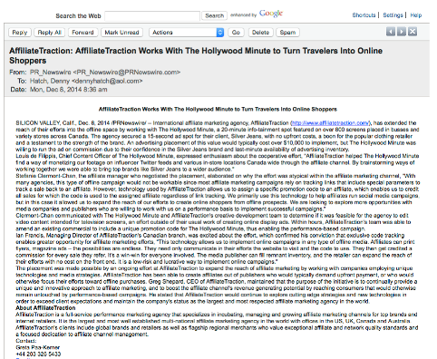
A sucker paid +/- $3200 for this press release.
Would I spend time on this
gray wall of type? No.
Newspapers
and magazines are dying because of gray walls of type—on the front page and
throughout the inside. They are boring as dirt and hard to read. Print
publishers blame the Internet for stealing advertising and putting them out of
business. The real problem is that gray walls of type make long copy unreadable.
This is true in print and in digital media.
Ed Elliott’s Visuals and Interruptions to
Turn a Skimmer into an Interested
Reader
4. Table of
contents.
5. Headlines
and subheads.
6. Photography,
especially of people and action.
7. Tables,
charts, graphs.
8.
Illustrations clarifying or reinforcing the text.
9. Captions
under every visual. People read captions as they skim
10. A word or
subhead which is bigger, bolder, blacker, or has a different color than
other elements on the page.
11. Enlarged
numbers, possibly followed by an enlarged or bold lead.
12. A word or line
set off at an angle or in a box or a burst.
13. Text inside an
arrow or a ruled box.
14. Anything that interrupts
a page-by-page pattern of columns.
15. Text with a
light screen behind it.
16. Pull quotes.
17. A paragraph set
off in bold or with a double indent.
18. Handwritten
indications.
19. Bulleted text,
especially with bullets that are larger or different from other bulleted text.
20.
Text Size: Ten or eleven points is optimum for readability; maybe one point
larger for older readers.
21. Column Width: 35 to 55 characters is a good target range. Ten or eleven point
is generally most readable on a column width of about a third of a page. Larger
than eleven-point should probably be about a half page wide. Columns wider than
a half page are not quickly read.
22. Alignment:
Rag right is often better than justified. It creates a text shape, which allows
an area for the eye to rest. It can also appear more inviting, less imposing,
more personal.
23.
Avoid:
Text without sufficient contrast to its background.
24. Avoid: background screen that is too dark.
25. Avoid: Paper color that is too dark.
26.
Avoid: Text
that is too light, printed in something other than black.
27.
Avoid
Text printed over—or reversed out of—a busy or distracting background.
28.
Avoid:
Text reversed out of a dark color.
29.
Avoid:
Flush right or centered paragraphs.
30.
Avoid:
Text that is too condensed.
31.
Avoid: Character
spacing that is too tight.
32.
In print: always
use a serif type for readability—Times, Garamond, etc. Never use sans
serif type in printed text. Why Johnny Can't Read —Vrest Orton https://heraldpress.ca/pdfs/resources/why-johnny-cant-read.pdf
33.
Online: sans serif type is best. In Search of: The Best Online Reading Experience —Sarah Dickinson
Quinn
https://www.poynter.org/archive/2005/in-search-of-the-best-online-reading-experience/
34.
With long copy: it is imperative to keep the reader’s eye moving.
David
Ogilvy on Readability
35.
After two or three inches of copy, insert your first boldface crosshead
(mini-headline), and thereafter pepper mini-headlines throughout.
36.
An ingenious sequence of boldly displayed mini-headlines can deliver the
substance of your entire message to glancers who are too lazy to wade through
the text.
37. Keep your opening
paragraph down to a maximum of eleven words. A long first paragraph
frightens readers away. All your paragraphs should be as short as possible;
long paragraphs are fatiguing.
38. "The first 10 words are more important than the next ten thousand. —Elmer Sizzle Wheeler
39.
Type smaller than 9-point is difficult for most people to read.
40.
“Widows”
increase readership, except at the bottom of a column, where they make it too
easy for the reader to quit. (A widow occurs when a line of copy is too long by
a single word, with the result that the word shows up in the next line—and is
the only word in that line.)”
41.
Break up the monotony of long copy by setting key paragraphs in boldface or
italic.
42.
Insert
illustrations from time to time.
43.
Help the reader into your paragraphs with arrowheads, bullets, asterisks and
marginal marks.
44.
If you have a lot of unrelated facts to recite, don’t try to relate them with cumbersome connectives;
simply number them, (as I am doing here.)”
44.
Never set your copy in reverse (white type on a black background) and never set it
over a gray or colored tint. The old school of art directors believed that
these devices forced people to read the copy; we now know that they make
reading physically impossible.
46. If you
use leading
between paragraphs, you increase readership by an average of 12 percent.”
47.
Short words! Short sentences! Short paragraphs! —Andrew J. Byrne, copywriter
48. With printed letters, always use the writer's real signature—preferably in blue—and NOT a phony baloney computer handwriting font signature. The signature is your handshake at the end.
49. With letters always have a P.S. It is the fourth most-read element in a letter. Spend as much time on the P.S. as you do on a headline.
How the
World’s Longest Full-page Newspaper
Advertisement Brought in Huge Reader Response
This
full-page ad ran in The New York Times, October 1948. The writer was
Louis Engel, former editor of Business Week who became a VP of marketing
and a partner at Merrill Lynch.
• The ad ran
6,550 (Six thousand, five hundred and fifty) words—the most words ever crammed
into a newspaper page. The record still stands.
• Entirely
text. Words only. It has no photographs or drawings... nor any charts, graphs
or tables.
• When Engel
finished writing the ad and it was laid out, there was space left over. He
decided to fill that extra space with an offer at the very end of the ad. The
reader was forced to read the entire ad—more than 6,000 words—before learning about the free book.
• The ad ran several times. Readers had to plow through this entire monster before coming
across the offer—an afterthought at the very tail end of the ad in a bottom
right box.
• Box at the very bottom setting off the offer with the mini-headline: "What's This? . . . What's That?"
“These
terms are defined in a booklet, ‘How to Invest’, which we have just published.
A basic guidebook for all security owners, this new publication develops in
greater detail the story of how this stock and bond business works. It reviews
the basic principles of sound investing, such as the analysis of market trends,
the diversification of holdings, and the management of a portfolio. We will be
glad to send you a copy."
“Always make
it easy to order." —Elsworth Howell, CEO Grolier Enterprises
Louis Engel’s copy
broke Howell’s Rule. The free book was a bitch to order: Here was the drill.
Either...
—You find a
piece of paper and pencil to write your request. Include your name and address.
Find an envelope to put it in, address the envelope, lick the stamp and go mail
it...
Or
—You spend
money on a long-distance phone call to Merrill Lynch in Boston. (This was
many years before 800 numbers or the Internet)...
Or
—You physically
betake yourself to a Merrill Lynch office to request the booklet.
What
Happened Was Astounding!
5,033 readers
contacted Merrill Lynch by mail, phone or a visit and requested more than
20,000 copies of the booklet. —Julian Lewis Watkins, The 100 Greatest
Advertisements
The Secret
of This Unbelievable Success:
Compellingly Written Plus Brilliant Design
Quite simply,
the ad was broken up into dozens of bite-sized paragraphs—the equivalent of
today’s tweets and texts. Among the elements:
• Upper
deck (super headline in Italics): “What everybody ought to know. . .”
•Main headline (big, boldface type): “About This Stock
and Bond Business
• Subhead (In Italics): “Some plain talk about a
simple business that often sounds complicated”
•Big bold
subhead
in mid-ad: How to Buy and Sell Securities
• 16
Boldface Crossheds (mini-headlines.)
Note: For
readable text of this 6,550-word ad:
https://swiped.co/file/about-this-stock-bond-louis-engel/
Critical
for Maximum Readability:
Number of Words in Each Sentence
I dug through
my correspondence and found the following e-mail from Scott Huch in response to
a column of mine on how to write:
“As an
aspiring, young direct mail copywriter in the early 1990s, I clipped an item
from my local newspaper. It has been taped to my desk—right next to my
computer—ever since. It is now tattered and yellow. But I keep it there as a
reminder anytime I’m writing.”
50.
Text of Scott Huch's clipping (above):
Tests have
shown that a sentence of eight words is very easy to read; of 11 words, easy;
of 14 words, fairly easy; of 17 words, standard; of 21 words, fairly difficult;
of 25 words, difficult; of 29 or more words, very difficult; so, this sentence
with 54 words, counting numbers, is ranked impossible.
51.
With every long sentence you’ve written, count the words. Any sentence longer
than 29 words should be split in two—or three.
###
Word Count: 1838
The Most Fun You Can Have
In the English Language
At age 15, Denny Hatch—as a lowly apprentice—wrote his first news release for a Connecticut summer theater. To his astonishment it ran verbatim in The Middletown Press.
He was instantly hooked on writing. After a two-year stint in the U.S.
Army (1958-60), Denny had nine jobs in his first 12 years in business.
He was fired from five of them and went on to save two businesses and
start three others. One of his businesses—WHO’S MAILING WHAT! newsletter
and archive service founded in 1984—revolutionized the science of how
to measure the success of competitors’ direct mail. In the past 55 years
he has been a book club director, magazine publisher, advertising
copywriter/designer, editor, journalist and marketing consultant. He is
the author of four published novels and seven books on business and
marketing.
CONTACT
dennyhatch@yahoo.com
Note to Readers:
May I send you an alert when each new blog is posted? If
so, kindly give me the okay by sending your First Name, Last Name and
email to dennyhatch@yahoo.com. I guarantee your personal information
will not be shared with anyone at any time for any reason. The blog is a
free service. No cost. No risk. No obligation. Cancel any time. I look
forward to being in touch!
IF YOU HAVE TROUBLE POSTING A COMMENT… EMAIL ME! I'LL HELP!
Google
owns Blogspot.com and this Comment Section. If you do not have a Google
account — or if you find it too damn complicated — contact me directly and I
will happily post your comment with a note that this is per your permission. Thank you and do keep in touch. dennyhatch@yahoo.com
Invitation to Marketers and Direct Marketers:
Guest Blog Posts Are Welcome.
If you have a marketing story to tell, case history, concept to propose or a memoir, give a shout. I’ll get right back to you. I am: dennyhatch@yahoo.com
215-644-9526 (rings on my desk).
You Are Invited to Join the Discussion.